7 Commercial Spaces Who Do Wood Walls Right
A challenging task for any company is to turn a commercial space into a statement piece that its customers can interact with the brand's product or services. The idea is to leave a lasting impression on your clients because we want them to come back again, and again!
With that in mind, everyone knows that wood is a great material for adding warmth to a space and for making it feel welcoming and inviting, all without minimizing its elegance.
We get it, it’s hard not to think of the dark, painfully faux wall coverings of the past. But wood walls today are so much more than that. We’re determined to change your mind!
Check out the following 7 commercial spaces that have beat down that horrific wood panelling reputation of yesteryear.
1) Bruce B. Advertising Agency - Stuttgart, Germany

Antitheses attract the visitor’s attention from the very first moment of entering the agency, beginning with the shape of the reception desk. It is crafted in exposed concrete, which displays an added materiality in the form of the visible structure of the wooden plank mould.
The concrete form is topped by a white, lacquered surface. Antithetical details are also present in the adjoining conference rooms – usually the second point of call for the agency’s clients. The walls of the smaller conference room are panelled with maritime pine boards.
Narrow yellow grooves refine their appearance, which would normally invoke simple packing crates, transforming them into attractive room panelling.
Get a similar look here.
2) Nando’s - Ashford, UK

Blacksheep Interior Architects and Design were commissioned to design a new location in Ashford, UK for the restaurant chain Nando’s.
They were to design a concept space that steered the client away from the traditional Nando’s design and put a Blacksheep signature style and twist on the well known and loved restaurant.
The client wanted to attract a more mid market customer base and move away from a mass market centred business structure.
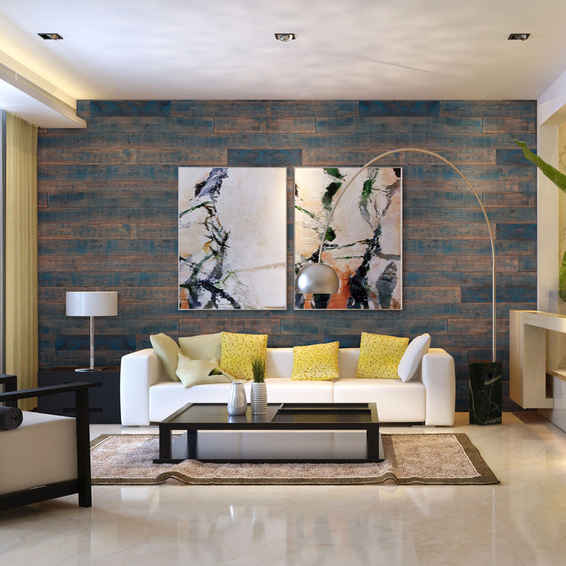
Get a smilar look with our BLUE-ISH AS-IS Wood Planks.
3) Don Café Company - Pristina, Kosovo
It was constructed from 1365 pieces of specially cut and formed plywood to create the impression of being inside a crumpled bag of coffee beans.
The idea was formed by the expansion of the business in order to offer clients with a greater possibility to taste Don Coffee products in the new environments of the Don Café House across Kosovo.
Through studies and research they were able to come up with a very unique visual concept expected to distinguish it from other traditional coffee bars by giving it a modern image.
Find a similar look here.
4)Textura - Chicago, USA
Textura’s office design works to emulate their corporate mission: to encourage collaboration and efficiency in the construction industry. The ‘raw’ aesthetic celebrates their relationship with the industry they serve. Incorporating construction site-inspired design elements like concrete floors, raw 2×4 slat screens to provide privacy, and collaboration spaces while at the same time inviting you into the space.
Check out Wall Theory’s “raw” aesthetic here.
5) The Archer Group - Wilmington, USA

The modern workplace is more than just a place where people gather to work. It’s the extension of a company’s brand, mission, and commitment not only to their clients, customers, and employees.
The 28,000 sq.ft. space opens with a reception area that features a reclaimed wood wall that illuminates The Archer Group name in LED strip lights. Continuing through the space, a large boardroom contains many custom details including the conference room table that was designed by a local mill worker.
Integrated technology allows employees to conduct virtual meetings and trainings with the flip of a switch. Smaller collaboration and team rooms can be found throughout the space that also seamlessly mix technology along with the client’s brand colors, providing a unique take on the reclaimed wood wall.
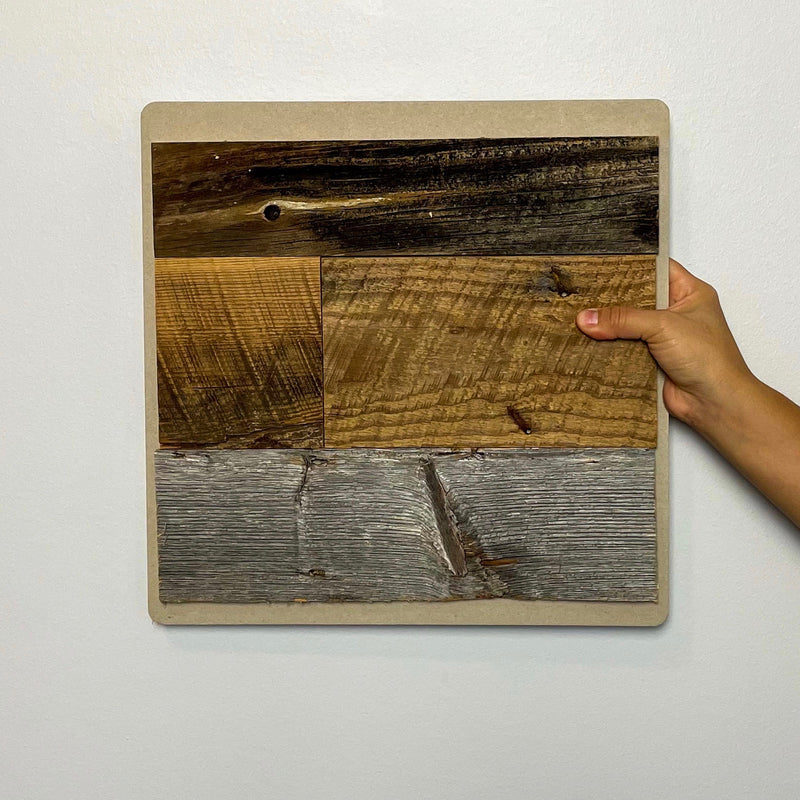
Be bold in color with Wall Theory’s RED-ISH Real Wood Wall Planks.
6) William Grant & Sons - New York City, USA

Stepping off the elevator, you’re welcomed by warm woods and a bronze-flecked concrete reception desk reminiscent of an upscale whiskey lounge. In the boardroom, commissioned whiskey-barrel artwork adds a modern touch.
Open workstations create a neutral centerpiece amidst dramatic surroundings. The focal point of the entire showroom is a carefully crafted, fully functioning bar and lounge.
This intimate space is flanked by wood walls, brand graphics, bottle displays, and an impressive hand-cut and pin-mounted William Grant crest behind the bar. The warmth, function, and sophistication of this space instills the brand’s vision into every aspect of the business.
Get the dark wood look here with Wall Theory’s BLACK-ISH Real Wood Wall Planks.
7) Waypoint - Toronto, Canada

This 5000 SF office suite opens to a panoramic view of Downtown Toronto, the focal point being the clock tower of the historic North Toronto railway station.
The use of natural white oak wall panels and flooring in conjunction with an exposed whitewashed concrete ceiling and suspended light fixtures creates an airy, light-filled procession into the suite and view of the Toronto skyline beyond.
Glazed partitions are framed in black, providing a clear delineation between the public and private spaces, and visually leading the visitor towards the offices and remainder of the suite.
Check out Wall Theory’s WHITE-ISH Real Wood Wall Planks.
We at Wall Theory hope the innovative and creative thinking of these companies has inspired you to incorporate wood walls into your sacred spaces.
We encourage you to take chances and to be brave in your renovation and design adventures! Take the past, dust it off, and make something new and refreshing!
