How to Give Your Home a Mid-Century Facelift
How to Give Your Home a Mid-Century Facelift
Here at Wall Theory, our goal is to enhance the love affair you have with your home! With a mid-century modern makeover, you can turn an outdated home into the stylish dwelling you never knew you had.
It can become tiresome to wake up to surroundings that need a facelift each day. We want to show you how the perfect balance of authentic vintage, vintage-inspired, and modern designs and accents can create a timeless interior. We hope these “before and afters” inspire you to think about the possibilities of your space!
Reviving Your Space
We all know kitchens are the hub of the home. It’s the space where you prepare all your means, and gather with friends and family. This particular “before” kitchen looked incredibly dated.
Although the previous cabinet style is popular for those who love a mid-century vibe, it’s clear that this kitchen could use some updating.
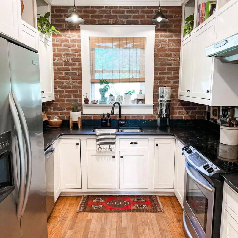
Painting the upper cabinets white and lower cabinets black is a classic combination that’s very much in style. The painted cabinets also make the space feel roomier. The “after” kitchen has the same square footage, but feels bigger and brighter with the use of white upper cabinets, tile, and the new recessed lights.
The addition of wood floors into the kitchen also helped tie this space to the rest of the home. We especially enjoy how it helps to highlight the wood frame around the window and door—creating an element of consistency throughout the room.
PRO TIP: Keep in mind, you never know what might lie under your floor! By removing tired carpet, you may just find the treasure of an oak floor underneath!
Kitchen (Before):

Kitchen (After):
Including Specific Defining Features
We’ll use the “before and after” below to create a design case study.
In the before photo of this space, the area featured several different wall colors, making it feel disjointed.
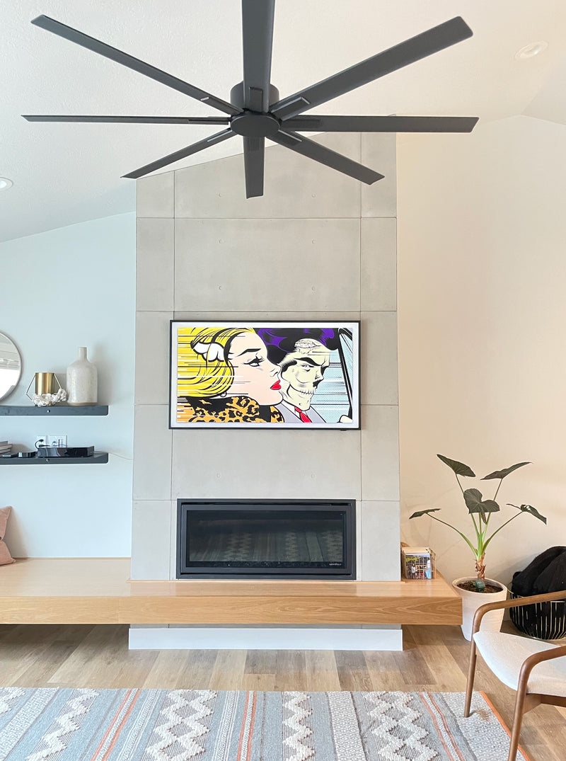
The new neutral wall color allowed the architectural details of the fireplace to shine. As a result, the room appears larger due to use of the same color throughout. When used incorrectly, color can break up spaces, and make a home feel cramped.
Furniture is also important in making a space feel cozy! However, you don't necessarily need to have the fanciest furniture. If something has great bones, just give it a facelift. This cost-efficient strategy also packs a big design punch. Those pieces you’ve inherited from Grandma will fit perfectly, and help the space pop into the 21st century.
With all the right angles in the architecture, both the free-form coffee table and the cowhide rug bring in curves that help to relax this space.
PRO TIP: Clutter is the enemy! Don’t be afraid to remove pieces you no longer love! In this case, removing artwork on the walls, and decluttering all of the plants and tiny knick knacks helped give this space room to breath. With all the extras gone, it's easy to focus on the features that make this house stand out. You will also feel a weight lifted!
Fireplace (Before):

Fireplace (After):

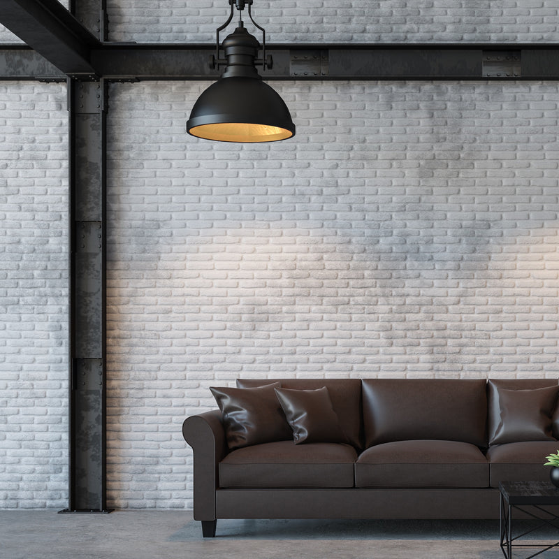
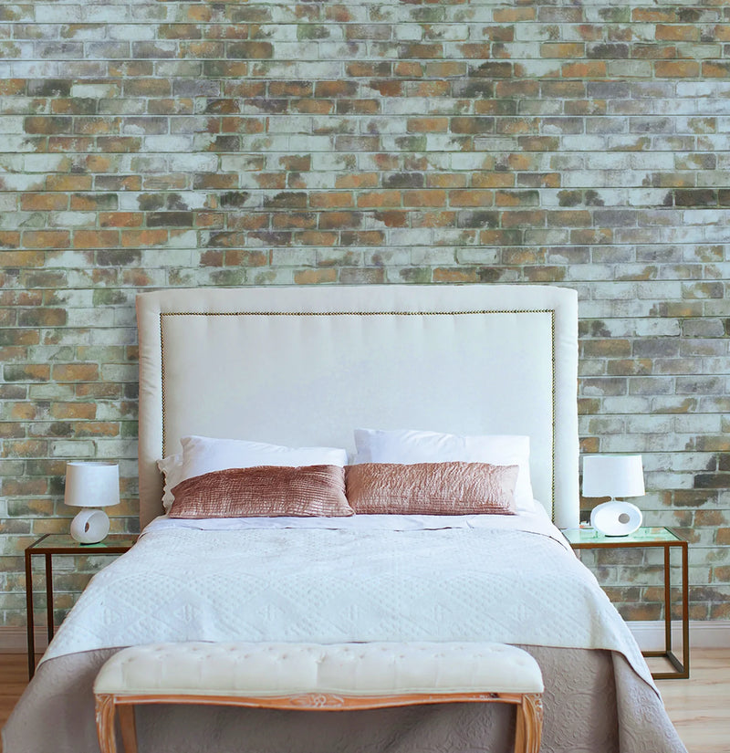
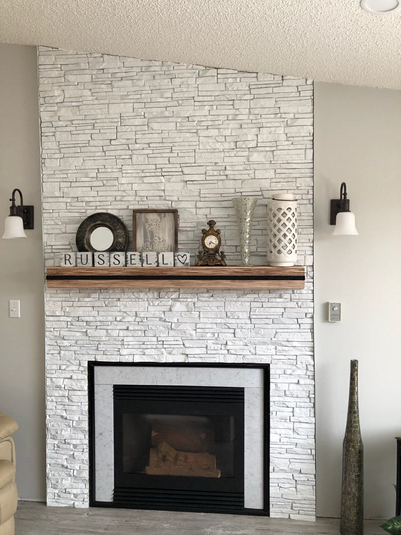
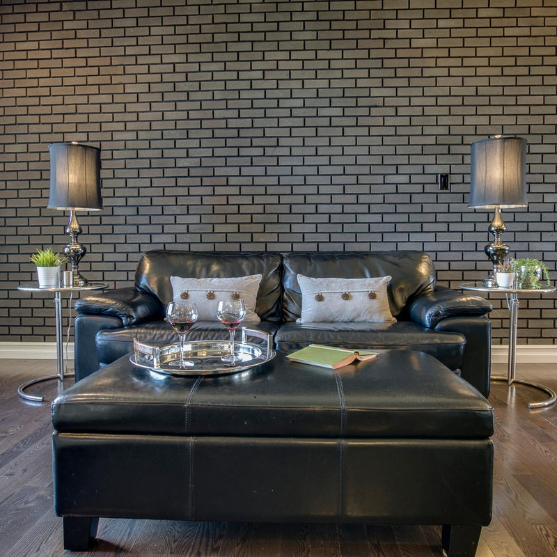
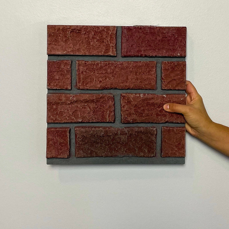
Check out Wall Theory’s Tuxedo or Old School Yellow Faux Brick Wall Panels to get a mid-century modern look:
https://www.walltheory.ca/collections/faux-classic-brick-panels/products/black-and-white-clean-faux-brick-panelGive Your Space Purpose
This empty room was begging for new possibility to take over! A few simple changes made it obvious that this is a great place to set up a dining table and take advantage of that floor-to-ceiling view.
Creating a dining area gives the space purpose. It allows a homeowner to understand the flow and abilities their home can have.
Choosing a vintage mid-century modern chandelier captured the spirit of the house, while the seamless transition of warm white walls and trim throughout enhances the continuity of the floor plan.
Also try using smaller decor choices in the dining room. This will draw visual interest to a plain wall, while the sheepskin on the chairs helps soften all the wood and brings in another textural element.
PRO TIP: A go-to trick to make a space more interesting is to inject a note of eclecticism! Don’t be afraid to mix patterns, palettes and periods of design within a single room. However, buy only what you like and want to live with in your house. Trends can be fun but they go out of style very quickly.
Dining Area (Before):

Dining Area (After):
Give your home a mid century, modern revamp with Wall Theory’s Classic Brick Vintage White Wall Panels: https://www.walltheory.ca/collections/faux-classic-brick-panels/products/vintage-white-faux-brick-panels
Keep With the Simplicity
If you're considering a mid-century modern design for your bathroom, one element that you can likely build your design around is a cabinet scheme. Mid-century modern cabinets tend to be sleek and minimal, with doors that are flush with the rest of the cabinet, and simple, straightforward hardware in angular metal designs.
Contrasting the stark angularity of the cabinets with curving bath features is a great way to continue the mid-century modern aesthetic. A curving, bowl-like tub—or a sink in an expanding rectangular or curved shape—can add real visual interest and a distinctly modern feel.
PRO TIP: In terms of tile and countertops, mid-century modern bathrooms tend to keep it simple, with flat tile and matte countertops. Another popular feature in mid-century modern bathrooms is glass—shower enclosures that take advantage of this feature will create a much more spacious feel in the bathroom.
Bathroom (Before):

Bathroom (After):

Unfussy, Functional, and Natural Looking
This time period is all about comfort mixed with high-style, creating a seamless connection between indoors and out. Try to mix in other styles into your space so that the overall feel is not too stark and cold. Keep your palette soothing, and try adding playful pops of color for visual interest. Try playing with textures in bedding, pillows, upholstered headboards, throws and area rugs as well!
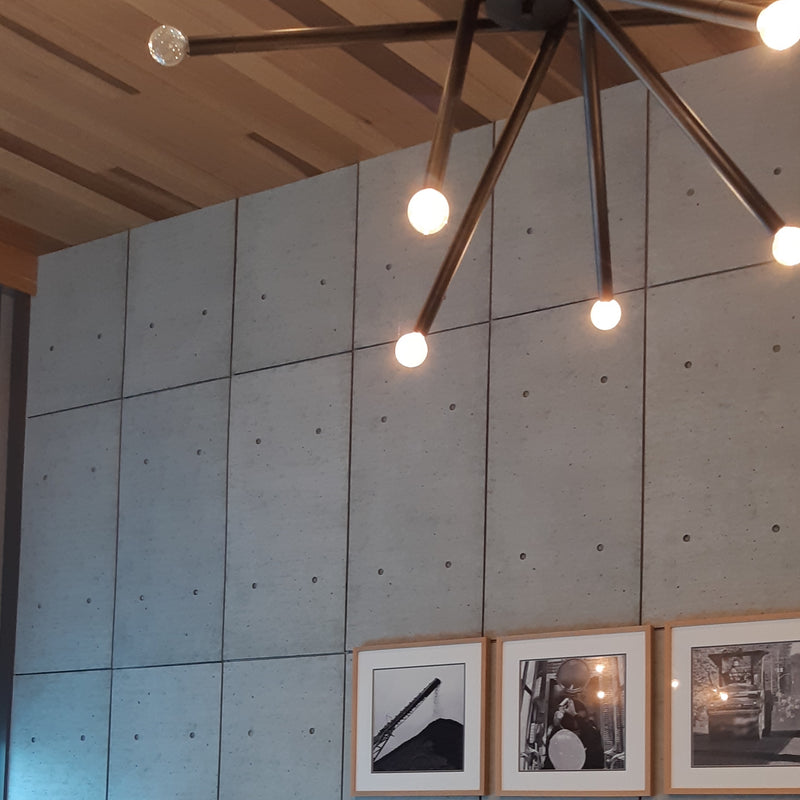
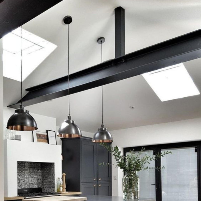
For example, a statement light fixture can help infuse drama into your space. Mid-century light fixtures are typically sculptural, so they act as a piece of artwork themselves. Be sure not to add more than one - these cool art forms will compete with each other if multiples are installed in a single space.
PRO TIP: A couple mid-century accessories, such as a piece of artwork or a retro style mirror, can go a long way in creating the look you’re after!
Photo credit: Interior Designer Orlando Soria
We hope to have inspired you to upgrade your beloved home! We here at Wall Theory believe you and your space deserve it! No matter your home’s era, you’ll be inspired by the result. You’ll find that the possibilities are endless.
